Guide
Adding Readable Text to AI Images Without Destroying Your Design
AI-generated text is almost always unreadable garbage. Here's the exact hybrid workflow I use to get clean, on-brand typography into any AI image.
Published May 17, 2026
Adding Readable Text to AI Images Without Destroying Your Design
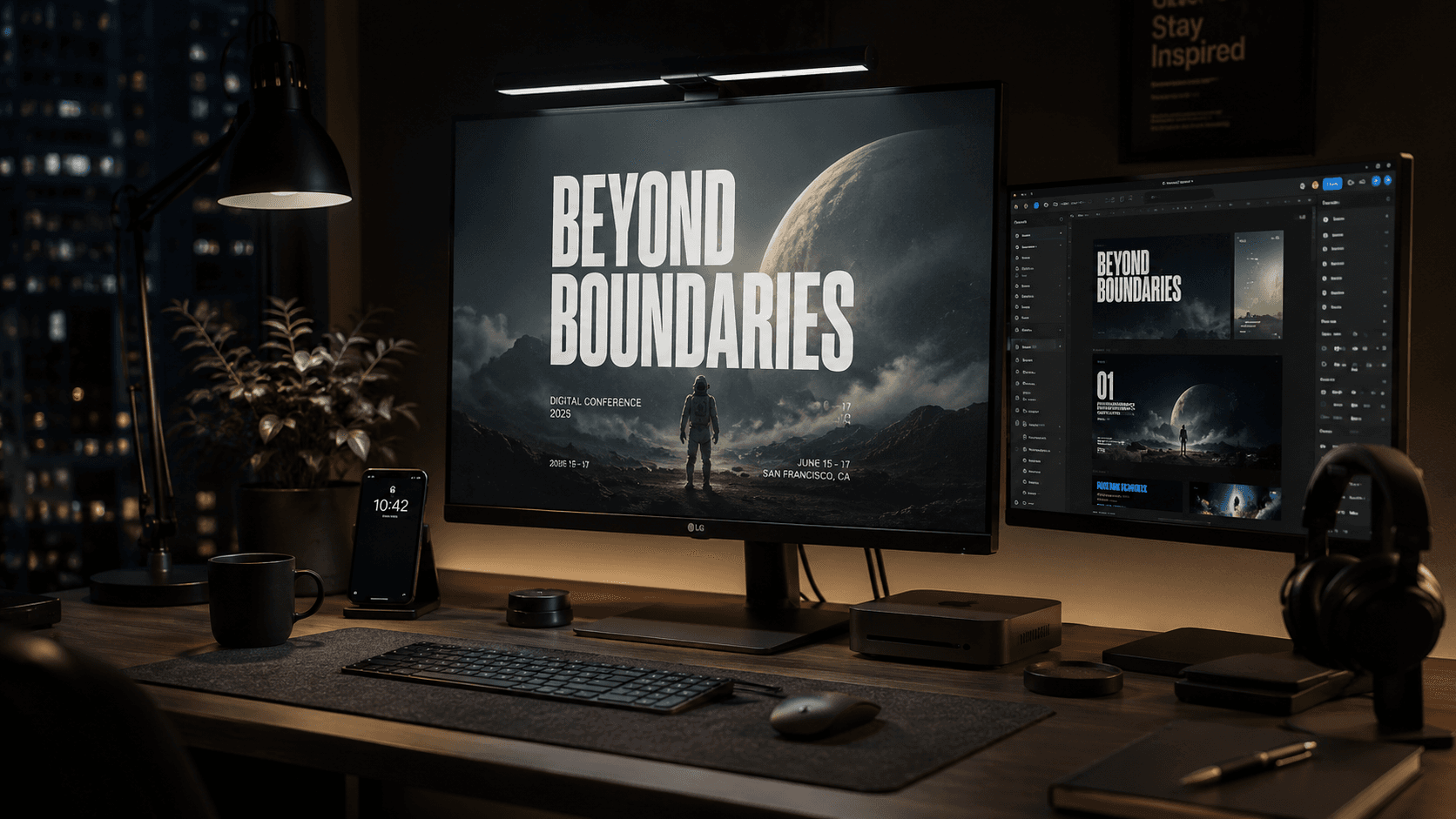
I had a client ask for a set of promotional banners — five variants, different copy, same visual style. The brief was simple: moody background, product shot, headline text. I figured I'd generate the backgrounds with Flux, drop the text in, done in an hour.
Three hours later I was still fighting with it. Every time I tried to prompt the text directly into the generation, I got either: illegible calligraphic scribble that looked like words but wasn't, or — worse — correctly spelled text that completely demolished the composition because the model had decided the typography was the main subject. The whole layout warped around it.
If you've hit this wall, here's what's actually going on and how I fixed it permanently.
Why AI Models Are Genuinely Bad at Text (And Probably Always Will Be)
This isn't a prompt engineering problem you can fully engineer your way out of. It's structural.
Diffusion models — the architecture behind Midjourney, Flux, SDXL, and most image generators — learn to synthesize images by training on pixel noise patterns. Text in those training images exists as a visual texture, not as a semantic system. The model learns that certain letter-shaped pixel clusters appear in certain contexts, but it has no underlying understanding of spelling, kerning, or typographic rules.
What you see when a model "tries" to write text is basically a high-confidence hallucination of what text-shaped pixels look like — assembled statistically, not logically. Some newer models (like Ideogram 2, or Flux with specific LoRAs) have gotten meaningfully better at short strings of text. But even the best current models fail on anything longer than four or five words, struggle with non-Latin scripts almost entirely, and are inconsistent run-to-run on identical prompts.
The second issue is compositional control. When you prompt for text, the model has to weigh it against everything else in the scene. A prompt like "bold white headline text reading SUMMER SALE on a moody ocean background" forces the model to treat the text as a design element. It then tries to place it compositionally — which often means distorting the background to accommodate it, or generating the text so large it eats the image.
The takeaway: do not rely on any AI model to generate your final production text. Use the model for what it's actually good at — atmosphere, lighting, background generation, style — and handle typography yourself in post.
The Actual Workflow: Generate Clean, Then Composite
This is the two-phase approach I now use on every project that requires text in an AI image.
Phase 1 — Generate the Background With Space for Text
The goal here is to get the AI to produce an image that has a natural, low-complexity zone where text can live. You're not prompting for text. You're prompting for real estate.
❌ Bad Prompt (Tries to do everything at once):
A moody dark ocean at sunset with bold white serif text reading "SUMMER COLLECTION" centered at the top, luxury fashion poster style, dramatic lighting
This gives the model conflicting jobs. It generates something — but the text area is either mangled or the whole composition fights itself.
✅ Good Prompt (Generates space, no text attempted):
A moody dark ocean at sunset, dramatic volumetric light from the left, deep shadow zone across the upper third of the frame, empty negative space in upper region, luxury fashion editorial, wide composition, no text, no watermarks, clean background
Key moves here:
"deep shadow zone across the upper third"— creates a natural dark area with low visual noise where text won't fight the background
"empty negative space in upper region"— directly signals the model to leave that area clear
"no text, no watermarks"— prevents the model from hallucinating text-like artifacts even when you didn't ask for them
Phase 2 — Composite the Typography in Figma, Canva, or Photoshop
Once you have your background, typography goes on top in any standard design tool. This is non-negotiable if you want professional output.
For most of my client work I use Figma because I'm already in it for UI work. But Canva handles this just as well for non-developers.
Basic Figma composite checklist:
- Export your AI image at full resolution (PNG, no compression)
- Import as a frame fill or drop it as an image layer
- Set your text layer above the image
- Use a
Drop Shadowor subtleText Shadow(2-4px blur, 40-60% opacity black) to lift the text off busy backgrounds
- For light backgrounds, use a semi-transparent dark overlay rectangle between the image and text layer — keeps text readable without obscuring the image
For Photoshop users, the same principle applies. Blend modes on a solid color layer (Multiply for darkening, Screen for brightening) give you non-destructive text-area control without touching the AI image.
When You Actually Need Text In the Generation
Sometimes the client wants text that looks painted, carved, or stylistically integrated — not composited on top. In those cases, use Ideogram 2 or Flux.1 with a text LoRA, keep the string under four words, all caps, and prompt it as a physical material:
✅ Text-integrated prompt (short string, material-based):
Stone-carved inscription reading "ATLAS" embedded in ancient granite wall texture, moss growing in letter grooves, macro photography, dramatic side lighting, no other text
Framing the text as a material (carved, painted, embossed, neon tubes, etc.) gives the model a visual reference class to work from. It performs significantly better than treating the text as floating typography.
Real-World Gotchas — What Still Breaks
Non-Latin scripts are basically off the table. Arabic, Urdu, Chinese — consistent, correct rendering from any current diffusion model is close to zero. If you need a language other than English and Latin characters, composite it in post, always.
"No text" prompts don't always work. I've had Flux ignore no text, no watermarks entirely and hallucinate a blurry watermark in the corner anyway. Check every output before delivering to a client. It's a 10-second check that saves embarrassment.
Ideogram 2 text is good — until it's not. At four words it's reliable. At six words, accuracy drops noticeably. At eight words, you're back to playing lottery. Don't push it.
Canva's AI text feature has the same underlying problem. I've seen people try to use Canva's built-in AI image generator expecting it to handle text because it's a design tool. The generator inside Canva is still a diffusion model — same limitations apply. Use the generator for backgrounds, then use Canva's native text tools on top.
Gradient overlays save broken compositions. If your generated background is too complex for clean text placement even after you've followed Phase 1 — add a gradient overlay in Figma that goes from fully transparent to 60% black over the text zone. It's a standard editorial photography technique and it looks intentional, not like a patch.
Conclusion
The fastest path to clean text in AI images is accepting that the generation step and the typography step are two separate jobs. Generate your background with deliberate negative space, composite your text in a real design tool, and only attempt model-native text rendering for short material-style strings. That split workflow has saved me from re-explaining broken deliverables to clients more times than I can count.
Written by Raza Hussain — Senior Full-Stack Developer, Aptech IT & SE student, and AI workflow freelancer. Published on AIPromptHub.tech.